
Guide
HyperOS Launcher Icon Style and Size: Make the Grid Easier to Read
Change the HyperOS Launcher icon style and size: where the controls live, which sizes suit small and large screens, and how to keep icons readable on any wallpaper.

Contents On this page
Why icons matter more than wallpaper
Icons are the only part of the home screen you tap, so their size and shape decide how the phone feels in the hand. A wallpaper is looked at; icons are used. This guide sets them up for readability first and looks second. Start with the file from this HyperOS Launcher site, so the copy on your phone is the build we tested, then follow the steps below in order.
Where the controls live
Long press an empty spot on the home screen and open the layout controls. The icon size and the grid size sit together there, because they are the same decision: a tighter grid with smaller icons fits more apps, a looser grid with larger icons is easier to tap on the move. Change both together, not one at a time.
Picking a size
On a small phone, the middle size is usually right: large enough to tap without looking, small enough that the first screen holds eight apps. On a large phone, the large size earns its keep, because the screen has room and the thumb has further to travel. The smallest size suits only a phone used mostly as a tool shelf, not a daily driver.
Shape and style
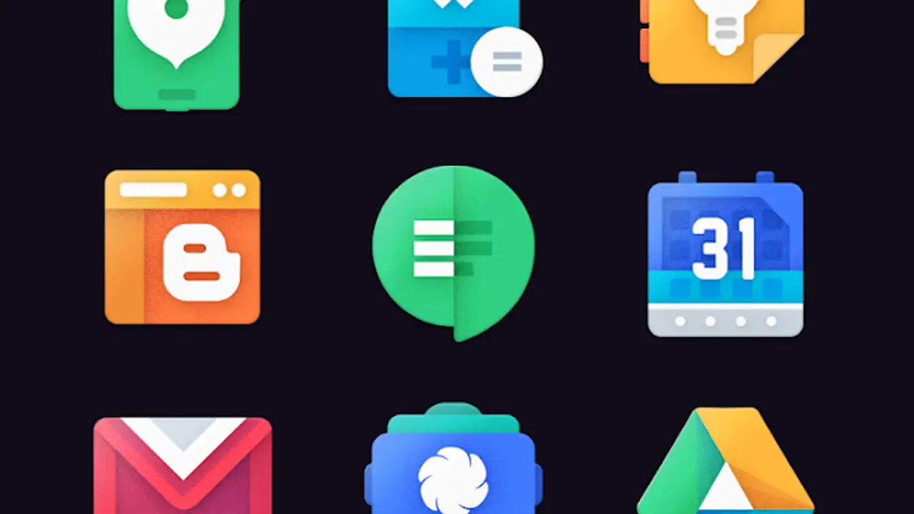
HyperOS Launcher draws its icons with rounded corners that match the widgets and the wallpaper, so the grid reads as one surface instead of a pile of squares. The shape is a system choice, not a per app choice, which is why the whole grid looks calm even when the apps inside it come from different developers.
Readable on any wallpaper
An icon grid is readable when the wallpaper behind it is quiet. If the icons disappear into the wallpaper, the fix is a calmer wallpaper, not a bigger icon: pick one with a plain area behind the grid and let the icons sit on it. Dark icons need a light patch behind them, and light icons need a dark one.
Labels on or off
App labels under the icons help for the first week, when the grid is still new. After that the shapes do the work, and turning labels off buys a cleaner screen without losing anything, because your thumb already knows where things are. Keep labels on for folders, where the name is the whole point.
When icons look wrong
An icon that looks stretched or tiny after an update usually follows a grid size change: the grid reflowed and the icon size did not follow. Open the layout controls, set the grid back to your usual size, and the icons settle. A single app with a broken icon is an app problem, not a launcher problem, and reinstalling that app fixes it. The fixes guide covers the rest.
Conclusion
Middle size on a small phone, large size on a big one, grid and icon size changed together, and a calm wallpaper behind them. Icons set up that way are readable at a glance and easy to tap on the move.
Quick Answers
How do I change the icon size in HyperOS Launcher?
Long press an empty spot on the home screen and open the layout controls, where the icon size sits beside the grid size.
What icon size is best?
The middle size suits most phones. Large icons suit big screens, and the smallest size suits a phone used mostly as a tool shelf.
Why do my icons look stretched after an update?
A grid size change reflowed the icons. Set the grid back to your usual size in the layout controls and they settle.
Can I hide app labels?
Yes, from the home screen layout controls. Keep labels on for folders, where the name is the whole point.